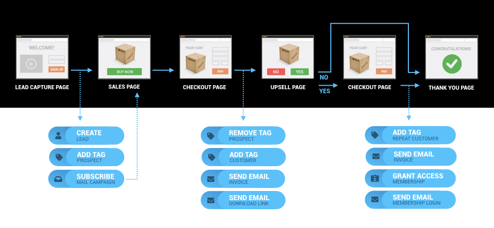
If we told you to create a sales campaign right this second, what would you do?
Start sweating bullets?
Make a list of all the components (and subcomponents) you need to create?
Research, read and take notes until your hand is physically cramping?
We’ve done all three at some point or another.
But the truth is, creating a sales campaign doesn’t need to be some stress-inducing task.
In fact, if you follow a few basic steps, you can create a profitable, comprehensive, and complete sales campaign without growing a single grey.
But, before we dive into the nitty gritty, let’s start at the beginning: with the definition of a sales campaign.
The Careers section of the money management website The Balance states that, “A sales campaign is a planned sales strategy that uses one or more channels to reach leads and convert them into customers.”
Seems pretty straightforward, right?
Think of it like your customer’s journey — from the moment they encounter your brand to converting them to cash-in-hand paying customers. How you do that is determined in part by the product or service you’re offering, the market you’re trying to appeal to, and the end result you’re looking for.
The First Step: Your Landing Page
What’s the first thing you do when you encounter a new brand? Or even hear about a new restaurant?
If you’re like most humans in this modern era, you’ll head over to your computer and type their website into your browser.
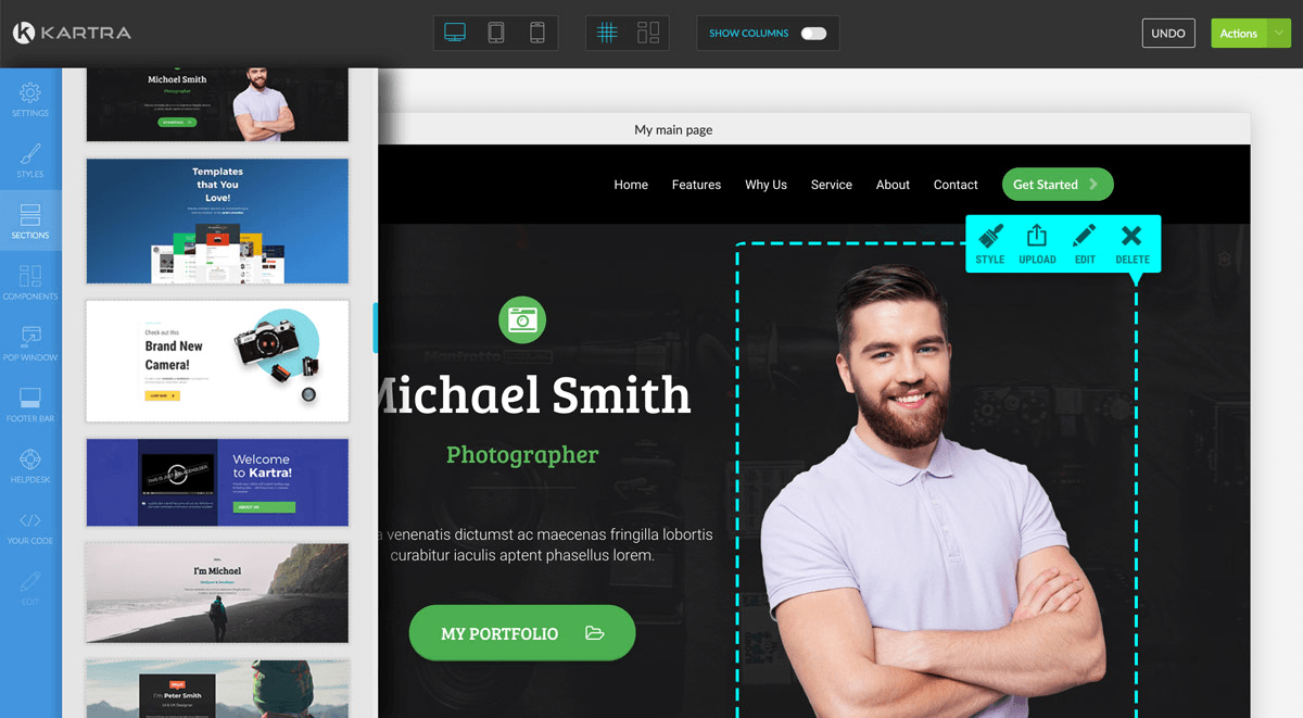
Your website is the first major touchpoint people will have with your brand — whether they’re coming in through an ad, a referral, or a simple Google search.
And a well-designed landing page can mean the difference between people quickly scanning and then closing your page (Yikes), or people visiting and opening their wallets to get your goods.
If your landing page is particularly well-designed and written, some visitors may choose to opt-in to receive more information about what you’re hoping to sell, even if they don’t immediately purchase.
And that’s okay too.
(Just please, please, please don’t have a website that looks like something out of 1985).
You see, it’s all about conversions — converting the people who view your targeted ads into customers, and getting them on your list is a step in the right direction.
But a word of caution.
Never direct people from your ads to your general website homepage or a generic page that may not have the information they’re looking for.
In his book Landing Page Optimization, Digital Marketing Advisor Tim Ash puts it well: “If the visitor can’t find something easily, it does not exist. If you emphasize too many items, all of them lose importance. Any delay increases frustration.”
Instead, direct visitors to a specially-designed landing page that highlights the information you want to put in front of them and steers them in the precise direction you want them to take.
For example, if you run a fitness business and you’re targeting new moms in an ad, don’t just send them to your main home page filled with buff looking dudes who look nothing like them, with information on courses they’ll never take. Instead, craft a landing page that speaks to your target audience — new moms — and direct them to that.
The Goals of Your Landing Page
So, we’re going to let you in on a little secret to success…
Every part of your online marketing efforts will require clear, concise goals.
But, these goals are especially important when considering what you want your landing page to accomplish.
Without specific, actionable objectives — like getting people to sign up for your newsletter, or getting someone to purchase a specific product — it will be close to impossible to create an effective landing page. (After all, if YOU don’t know what you want your visitor to do, how on earth will they know which button to click?)
For this reason alone, your goals should be crystal clear before you begin designing your page.
Deal?
Deal.
For the best results, your landing page should be as simple as possible and highlight only the product or service your sales campaign is focused on.
Remember, too many options will only frustrate potential customers…and being chased down the street with pitchforks by a mob of confused visitors is never fun (JK no business owner will be chased, but you’ll probably lose a sale).
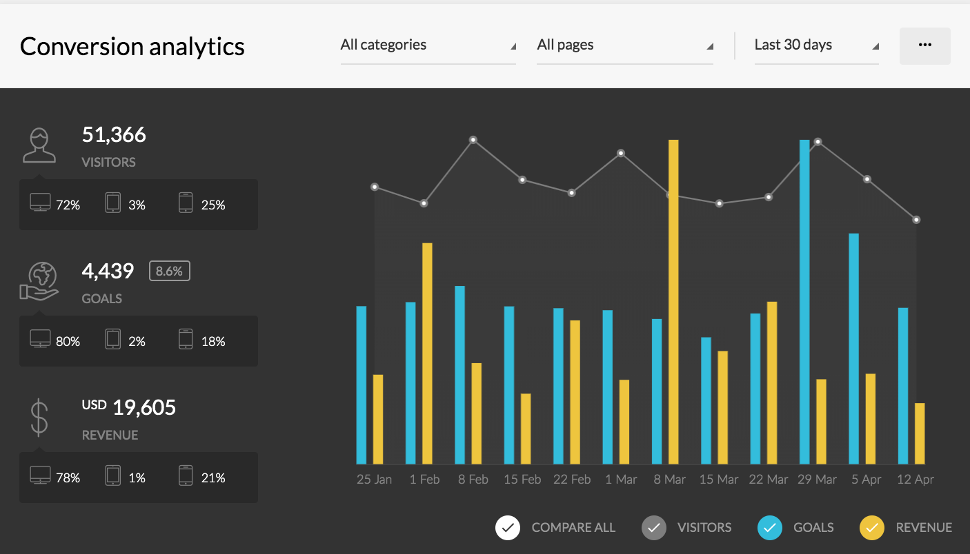
You’ll also need to develop specific expectations for your landing page so you have some idea of how successful it is once you implement it.
You can base these expectations on a variety of things — the sales goals you’d like to hit, the sort of sales you feel your products can reasonably expect, and for those of you that have a little experience under your belt, the percentage increase you’d like to see compared to the sales you’re already making.
It’s helpful to have specific, measurable goals to which you can compare actual results.
This means, no goals like “I want a lot of sales,” but rather something like “I’d like to keep my cost per lead under $5.” Or, “I want to make 10 sales per week,” or, “I’d like to get 1000 click-throughs to my website per day.”
These concrete goals give you something to actively measure your success against, and determine how effective your initial efforts have been.
The Call to Action
What do you think the most critical part of a landing page is?
The headline?
The design?
How about the call to action?
If you’re not familiar with the term, a call to action is the part of your landing page that communicates to your target audience what you want them to do once on the page. It’s the glowing orange “buy now” button or the “learn more” link that beckons you to click.

And let’s be real.
This is the MOST critical part of any landing page or opt-in form (more on that in a bit), because without it, you ain’t getting no results.
So if a call to action is so important, how do you make it good and clickable?
First, it should relate directly to your goal, and should be the culmination of every other element on your landing page.
Your headline, the copy you’ve written for the body of the page itself, and even the images and overall layout should support your call to action. (Please don’t have a page with a headline about losing weight, an image of a fit lady and then a CTA to buy girl scout cookies…as delicious as they are, this just makes zero sense).
Use a strong, direct command verb to begin your call to action.
In order to present the most critical information in as little space as possible, you can’t use a ton of space or a lot of verbiage to get your point across. Let your potential customers know exactly what you want them to do, and guide them to that action in direct and straightforward language.
Whether it’s “Buy now!” or “Book an appointment!” or even something like “Sign up for product updates!” it’s important to get straight to the point.
Words like “buy,” “order,” or “shop,” are all good candidates to lead a call to action, but you might want to change it up depending on your product.
Using personal pronouns in your call to action also helps increase conversions. Instead of “Download Our Tip Sheet,” try “Download My Tip Sheet!” Or use phrases like “Sign Me Up!”
If you’re hoping that potential customers will want to request information about your product or service, try “Learn more!” or “Tell Me More!”
Above all, you want it to be actionable. You don’t want a call to action to blandly state something like “More information is available …”
Instead, make it fun and exciting. “Gimme More Info Now!”
The Opt-In Form
If you’re in need of leads to grow your business fast, who you gonna call?
Don’t say ghostbusters.
That was a trick question; you don’t need to call anyone. Just add an opt-in form to your page.
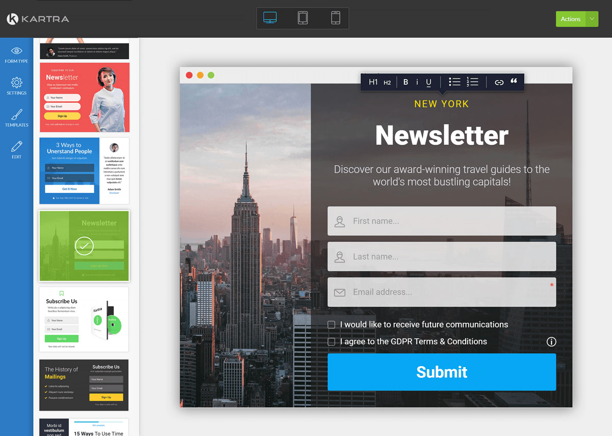
Like a call to action, an opt-in form is a part of your landing page where you invite potential customers to enter their email address in exchange for something like a freebie, or to sign up for your newsletter.
At the end of the day, having a large email list is the KEY to growing a business and getting sales over time. (Fun Fact: Our CEO, Andy, attributes his email list as the number one thing that gave him success).
In a blog entry about opt-in forms from WordPress plugin creators, Hello Bar, state that, “Email opt-in forms should be short and sweet. If you ask for too much information, you’ll scare off people who don’t have the time or energy to fill it out or who worry about their privacy.“
And it’s true. Think about it. If you go to a website to download a free guide, and they ask for your full name, your email address, your phone number, your home address…well, do you really think you’re gonna give up that info? Probably not.
For the most part, all you really need is a first name and email. If you’re signing people up for a live phone call, ask for the phone number too, but be aware that the more info you ask for, the fewer signups you’ll get.
Converting Leads to Successful Opt-In Opportunities
Now you may have caught that we called email subscribers leads in the above section…
They’re called this because each email address or each subscriber is perhaps only an email or two away from becoming a paying customer — those email addresses “lead” to sales.
To convert the highest possible number of visitors to your landing page to leads, you’ll want your opt-in form, like your call to action, to be persuasive and straightforward.
In order to do this, you have to understand what is likely to capture the attention and imagination of a visitor. What is likely to make them actually want to give you their email address and sign up for the information you’re asking their permission to send?
Again, you want to be compelling. A person’s email address represents a direct line to them, and as such is one of the most personal and intimate forms of contact available in online communication.
If you have a bland, generic request for people to subscribe to your newsletter, you’re not likely to see much in the way of conversion. It’s lazy, clichéd, and just doesn’t come across as anything other than an unimaginative, impersonal request.
If you’re not excited about what you have to offer, how can you expect your potential customers to be?
Instead, create something they’ll want to read. A valuable resource that you’re offering to give away — for free — in exchange for your lead sharing their contact information with you. If you’ve done any prior reading about how to build a sales funnel, you may have come across the term “lead magnet,” and that’s exactly what this is. It’s the most persuasive way to craft an opt-in form that landing page visitors will want to click on and sign up for.
It draws on a psychological factor called the Principle of Reciprocity. Tim Eisenhauer, president and co-founder of Axero Solutions, writes in a blog entry on his company’s website: “The principle of reciprocity relies on our powerful, internal sense of obligation. When someone does something nice for us, we feel indebted to that person and compelled to do something nice for him in return.”
In other words, people are more inclined to do something for you or share something with you — like their email address — if you have first done something for them. Provide them with something they can use, which can be as simple as a quick write-up on ways to solve problems your goods or services can help with — but without relying on what you’re selling. That part comes later…
Creating a Persuasive Lead Magnet

The lead magnet you create needs to be highly relevant to your ideal customer. I.E., If you’re trying to attract clients for your online financial course, don’t lure them in with a guide on how to get ripped in 90 days…they’ll just get ripped and smack you when you later pitch them with something completely unrelated.
In the world of sales funnels, more emails on your subscriber list isn’t the absolute goal. It’s good, but what’s better is having the email addresses of your ideal customers, the core group of people you’re looking to market yourself to.
A list full of random email addresses is a list full of people who may never buy your product or service, and who furthermore may become annoyed that you’re sending them information or offers they don’t want and can’t use. That’s bad in a couple of different ways. Not only will your reputation (and that of your business) suffer, but it’s also bad for future email campaigns, as your outgoing efforts may get flagged as spam, and will make all future email marketing attempts that much more difficult.
So, it’s important to attract the right kind of email subscriber…and you do that by creating a lead magnet tailored to the type of customer you hope to attract.
If you were to give everyone who signed up for your email list the newest iPhone for free, you’d be guaranteed to receive a lot of opt-in action…
But that would ultimately be a bad idea, and not just because it would cost you a fricken fortune.
You’d be attracting everyone who wanted the iPhone free of charge, and not targeting your ideal consumer base.
Instead, you want to offer something that your customer would want. If you’re selling products related to something like, say, container gardening, you’ll want to offer a lead magnet like “Ten Essential Tips for Urban Gardeners.” If you’re selling some kind of kitchen or culinary product, something like “A Dozen Quick Tips for the At-Home Chef” would be more appropriate.
In this way, you specify exactly who the lead magnet is for. You won’t have as many sign-ups, but the ones you get will be interested in what you’re selling.
Quick, Actionable, Helpful Solutions
Now, it may be tempting to throw the whole enchilada at your lead magnet, but in reality, something that’s easily and quickly grasped is more helpful.
There are a lot of websites and products online clamoring for your customer’s time, and people tend to have short attention spans. This means people will be hesitant to download something if they think it’s going to require a sizable time commitment to engage with or consume.
While you can create something like a long e-book or an involved learning course that will take them several hours to read, it’s just more work for you and is likely to have no more success than something short or sweet.
Side note: We once gave away a hundred-page guide on growing a business. It got some leads, but was not worth the work we put in. And it was so overarching and vague, that a lot of the leads we did get, weren’t interested in going further with us. Other times we’ve given away highly-targeted 3-page guides we whipped together in a day that have gotten us thousands of interested leads.
So what should you do?
Your lead magnet should be something focused, specific, and quick to put into action. It doesn’t need to be a complete solution to every problem your potential customer might be facing — that’s where your product comes in. Instead, you want it to be a quick fix to some nagging, minor inconvenience they may be faced with.
A quickly explainable skillset, a fast workaround or ease-of-use tip, or some other form of useful information that your ideal customer can immediately apply to his or her life is what you’re shooting for. And you want it to be helpful — you want whatever you’re offering to make a small, but noticeable improvement in whatever problem your lead might be facing.
If you’re an email marketing guru, for example, a good lead magnet might be a downloadable PDF with 100 of your best-performing subject lines. It’s enough to grab attention and be helpful, but doesn’t solve their entire problem.
By making something in their life easier for your potential customer, you’re building trust and nurturing a relationship that will ultimately enable you to convince them to buy from you — the ultimate goal.
Bear in mind the fact that people thrive on instant gratification, so for maximum effectiveness, your lead magnet should be something that can be delivered to them instantly — anything digital, whether it’s a link to a video, an MP3, a PDF, or even just an email full of helpful tips.
Writing Your Opt-In Copy
Now that you’ve created your opt-in incentive, it’s time to write the copy to go along with it.
And before you start trembling at the thought of writing copy, know this: it doesn’t need to be anything wildly imaginative or out there.
The first part of your opt-in text should be the title of the lead magnet you’ve developed. This is crucial — think of your incentive title as a heading or headline that quickly sums up what you’re offering.
As with everything on your lead page, you want this to be clear, concise, and to-the-point. You don’t want to rely on gimmicks or some joke that might fall flat. You want to be straightforward about what you’re offering, and what it will do for them.
Some good examples to think of would be along the lines of “12 Surefire Headlines for Writing Viral Blog Posts,” or “How To Write Facebook Ads That Get The Click Every Time.”
You want to present a package of helpful tools that is easy to understand, easy to digest, and easy to put into action—and you want all of that to be clear from the title alone. Like all advertising copy, this should be punchy and memorable.
While oldschool thought trains will tell you shorter headlines are better, CoSchedule will tell you that that’s not always the case. They find headlines in the 50-70 character range perform the best (but as always, test, test, test).
The next part of your opt-in copy is the description of what you’re offering. This is really where you sell your visitor on giving you their email in exchange for your freebie.
Think of the objective they want to reach — better Facebook ad results, a flatter stomach, or a stay-at-home job that will pay all their bills — then think of a problem they’ll have to solve or an action they’ll need to take in order to accomplish it.
That action should interface with your offer like two puzzle pieces fitting together. Your offer should be the solution to overcoming the obstacle that’s in their way.
With that in mind, your opt-in description copy should read something like, “Are you wasting money on Facebook ads that don’t get results? We’re giving away a dozen sure-fire Facebook ad templates that have been tested and proven to convert — so you never need to burn through cash on an ad that doesn’t work.”
The last part of your opt-in is the call to action, which we’ve covered above. You want a call to action that inspires immediate engagement, something that your lead doesn’t have to think about twice.
A Thank You Is Always Nice
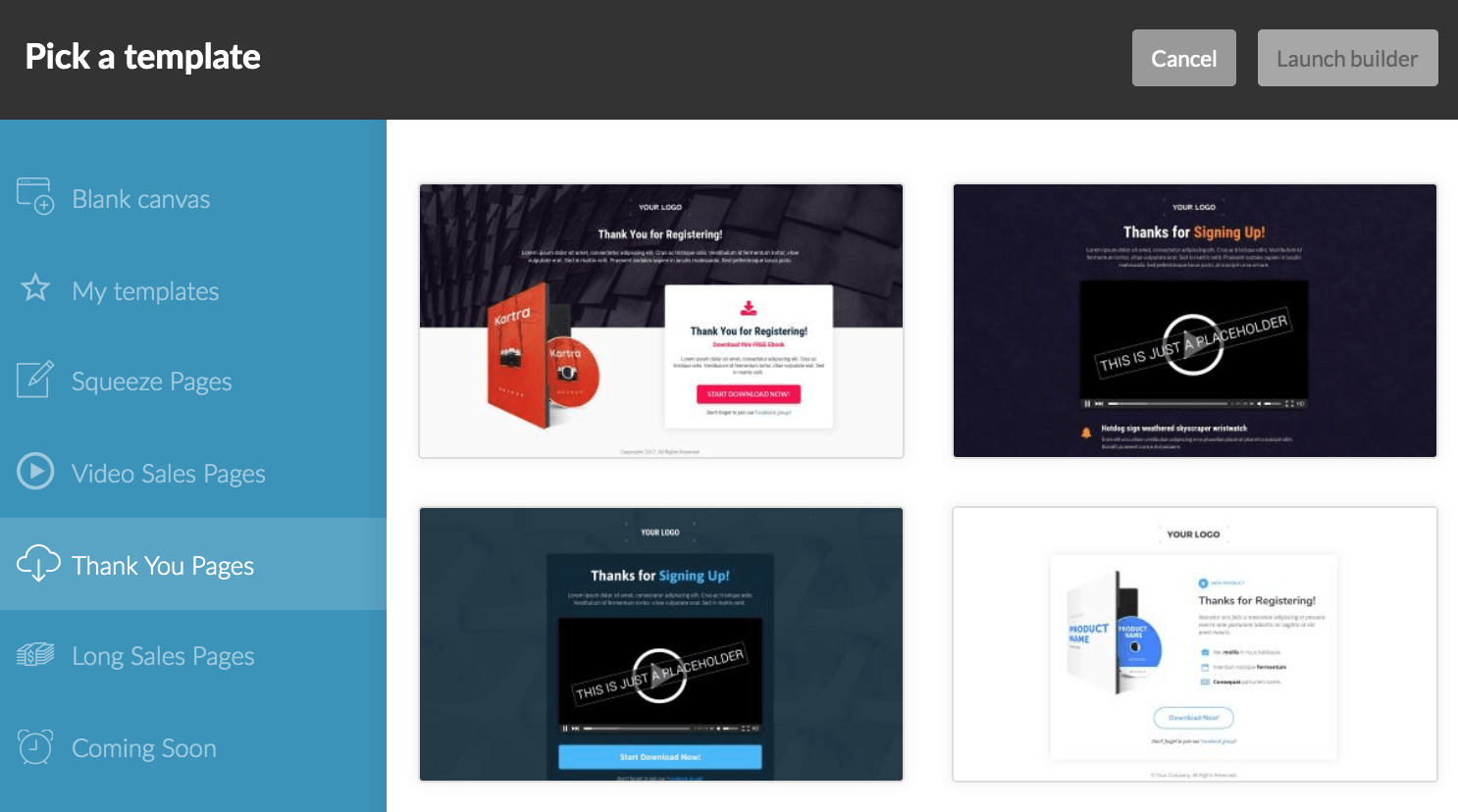
Once someone completes your opt-in form, it doesn’t just end with the submit button.
When a visitor or lead to your landing page completes that action by grabbing that tip sheet or downloading that PDF, you want to immediately send them to a thank you page.
And the thank you page is a great opportunity to continue engaging leads. You can utilize the thank you page to direct them to another section of your website, make an immediate sale, make it easy to engage with your brand on social media, or any other follow-up action that can further your relationship with this potential new customer.
A “Thanks, your tip sheet is on the way!” might be simple and straightforward, but it’s like leaving money on the table. A lead who has already bought in to your call to action and taken advantage of your opt-in offer is much more likely to go a step further and continue to engage with your brand, but you have to present that opportunity to them in order to make it possible.
So what can you do on your thank you page?
A well-designed thank you page should include a thank you in one form or another—thanks, order confirmed, your tip sheet is on the way — but should also include an additional call to action directing them toward another resource — your most popular blog posts, a product listing, or even just sending them to the main page of your website so they have the opportunity to learn more about what you’re about and what you’re offering.
It should also offer a way to connect on social media, or an exclusive offer to those who have already opted in — a bonus free offer for a product similar to your original lead magnet, an exclusive video course, or even just a list of tips on how to get the most out of the product you’ve just sent them for free. This creates a feeling of trust and gratitude, and showcases your brand as one that’s got their best interests in mind, and is eager to serve them. Your thank you page should serve as an opportunity to create a stronger bond with your lead, if nothing else.
And another word about social media, before we move on to the next (and last!) step in creating a successful sales campaign: you should absolutely include the option to share your page, program, or website on other social media platforms. If a potential customer who has just opted-in can easily share your information with his or her friends, you can use your thank you page as a force-multiplier and drive even more leads your way.
Chelsea Adams, writing on Bruce Clay’s “Smarter Search Marketing” website puts it best: “The only thing better than one interested lead is 100 interested leads.”
Last but Not Least:
The Automated Follow-Up Email
Now that you have a new contact — a new lead converted to a follower or maybe even a customer (Go you!) — this is the time to capitalize on that relationship and do everything you can to cement the bond.
An effective follow-up is a crucial tactic for your business, and the last stage of your successful sales funnel. When you can automate that follow-up, it becomes even more effective, because it’s immediate, it’s well planned and thought out, and continues along the lines of all the messages you were able to get across on your landing page.
Even better, it nurtures those new leads into paying customers with virtually no additional work (so yes, you can play hooky and still have your business running like clockwork).
Your follow-up sequence needs to be well thought out and strategic.
It, like your landing page, call to action, and opt-in efforts, should be the result of a specific, tailored plan of action intended to achieve a specific goal. Automation is one of the most effective ways to continue to cement your relationship with leads, so it’s worth the effort to make sure your follow-up brings leads back to your site, continues to build a relationship with them, creates and nurtures opportunities for further conversions, and contributes to the overall satisfaction a lead or customer feels toward your brand.
Strategize Your Follow-Up
Truth be told, there are many different follow-up strategies you can employ, based on the action your customer took.
But, in general, your follow-up strategy should emphasize customer service, encourage repeated interactions with your website or brand, and highlight offers or products you have which they may also have an interest in.
Imagine the absolute ideal experience you want each lead to have in the follow-up process, and build your automated email follow-up on that experience.
If you want to really impress a new lead from the moment they opt-in, provide them with more great content in your emails that will make them excited to see future messages from you. This means sending them emails with lessons and tips to help nurture your relationship and position your brand as the expert.
If they’ve already converted to becoming a customer, you want to provide the kind of customer service that they feel motivated—and enthusiastic—about sharing with their friends and family.
You can increase engagement by emailing new blog posts, asking your leads what content they’d like to see, incentivizing social media follows by offering discounts or product bundles — the options are almost endless. You can encourage repeat sales by sending info on customer rewards programs, or giving “existing customer only” discounts.
Your goal here is to position your brand as something that adds value to their life. When they see an email from you in their inbox, they should want to read it, because it will add to their lives, instead of instantly trashing because it’s just another sales pitch.
This will differentiate you from your competition. By offering discounts or additional free lead magnets, you’re establishing trust and nurturing a relationship while delivering as much worth and benefit as possible. Furthermore, your automated email follow-up is an opportunity to educate your leads with facts they can use to make an informed decision when it comes time to purchase the big ticket items you’re trying to convert them to — the full sixteen-week info packet, the full-length, invitation only webinar, or the bundled product package that is the core of your sales efforts.
Through this kind of thoughtful, targeted email follow-up, you’re able to convert leads to sales, and one-off sales to repeat customers, and repeat customers to all-in consumers of whatever good or services your brand offers.
But…just sending the emails isn’t enough.
You need to know if they’re working.
Make sure your email automation tool provides detailed analytics. Test subject lines. Test messaging strategies. If you repeat this process for every new sales campaign you embark on, you can, over time, determine what works best for your ideal lead or perfect customer.
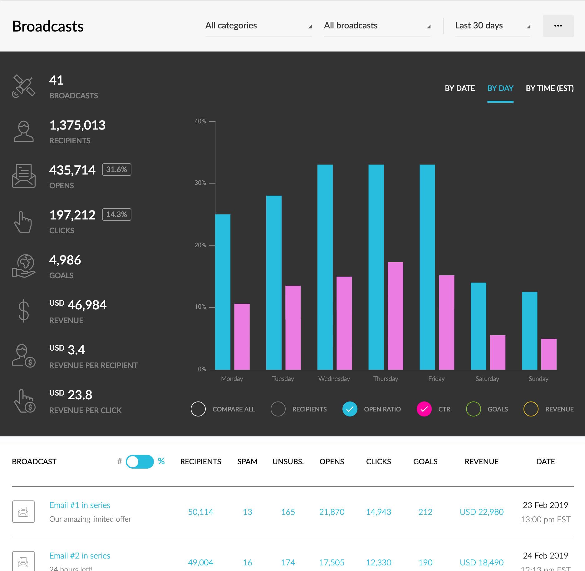
This way, you can keep striving toward the perfect, flawless follow-up sequence that automates as much of your business as possible and earns you nearly passive income while creating happy, satisfied customers who hold your brand, product, or services in high esteem.
That’s what we in the biz like to call a win.
Putting It All Together
Okay, we know this hasn’t been the shortest article you’ve ever read, but looking back, can you see that it’s not that difficult?
In fact, creating a campaign is fairly straightforward: landing page, call to action, opt-in form, and automated email follow-up.
But…now that you understand it…what if we told you there’s a way to create a campaign with almost NO work?
Your landing pages would already be designed — you’d just need to plug in the copy.
You can even get landing pages with opt-in forms already built-in.
AND your automated follow-up would already be configured and best of all, written for you. You just need to tweak the brand name and benefits and click go.
Does that sound…too good to be true?
Well, it’s just one of many features in Kartra. Every single user on every single plan gets access to our Done-For-You campaigns, created by world-class marketers like Frank Kern and Andy Jenkins.
These campaigns have generated millions of dollars of revenue online, and now they’re available to every Kartra user.
